
The Affordability Problem: Why Wealth Doesn't Always Translate to Affordability

In the last post we looked at what we mean when we talk about affordability, and how it’s an inherently subjective metric. We examined data around rising costs and income to try and put the question of affordability in context.
In this post we will shift focus to look at assets and wealth, and how they shape perceptions around affordability.
How Assets Factor into the Financial Aid Calculation
As financial aid practitioners know well, a family’s income plays a major role in how that family thinks about what they can afford. The financial aid calculation itself results in a number referred to as discretionary income: the income that a family chooses how to spend, once basic living expenses have been paid. As a reminder, here are the steps for calculating what a family can afford to pay for tuition:

A percent of this discretionary income is what is deemed to be available to pay for tuition.
To really understand how assets influence the above equation it’s important to understand two things.
First, assets enter the calculation as a percentage rather than at full value. In Clarity Financial Aid, this calculation is handled by the Asset Allocation % table in the methodology settings. The specifics vary across financial aid methodologies, but the underlying principle is similar: a percentage of total assets gets factored into the calculation rather than the full value, with that percentage typically scaling based on the size of the asset portfolio. For example, with a 2% asset allocation percentage for assets of $25,000 or less, a total asset portfolio of $25,000 would convert into just $500 added to a family's effective income, included as part of their discretionary income.
Second, only a small percent of the family’s resulting discretionary income is earmarked for tuition. The discretionary income ranges work similarly to a progressive tax: the more a family has, the higher the percentage deemed available for tuition.
These two reductions — first of the asset portfolio, then of the resulting discretionary income — are specifically designed to avoid over-counting a family's assets and arriving at a tuition figure that feels, well, unaffordable.
What the Data Shows About Assets and Wealth
Having looked at the state of incomes in the country in our last article, what do we see when we try to look at assets and wealth?
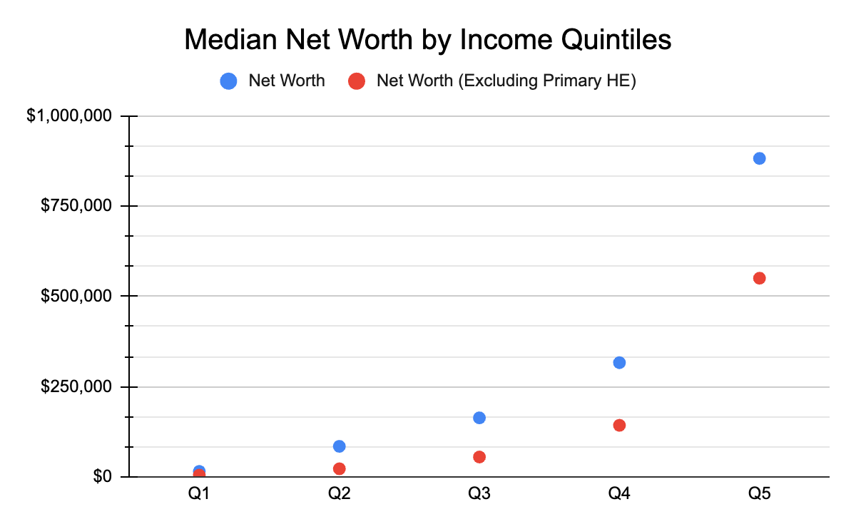
The following data visualizations refer to the U.S. Census Bureau’s 2023 report on Wealth, Asset Ownership, & Debt of Households Detailed Tables: 2023. Both tables show total net worth as the blue dot, and net worth minus primary home equity as the red dot.
A note on reading quintile comparisons
Because income quintiles sort households only by current income, each band contains demographically different households at very different life stages. A retiree living on Social Security and pension income but drawing on $400,000 in lifetime savings is in Q1 by current income, even though their financial picture looks nothing like a young worker earning the same amount. Similarly, a mid-career professional just hitting peak earnings sits in Q5 alongside established households with decades of accumulated wealth.
This life-stage mixing is part of what drives the wide gap between median and mean values within each quintile, and it's worth keeping in mind as we look at the data.
.png)
The picture for assets and wealth in 2023 shows a sharp gradient across the income quintiles, with the gap between the bottom and the top especially wide. By comparing the median chart at top with the mean (average) chart below, we can also see the impact that outliers have on statistical groupings.
The median numbers (top chart) for Q1 are $15,100 of net worth (blue dot) and $4,100 of net worth without primary home equity (red dot). This puts 50% of Q1 below those thresholds.
However, the mean numbers for Q1 show $177,700 for blue and $87,930 for red — significantly higher than the median. That gap tells us that those at the upper end of Q1 are in a far better position than the lower 50%. As noted above, this reflects both genuine variation in financial circumstances within Q1 and the life-stage mixing inherent in quintile sorting. Households with substantial accumulated savings but currently low income (often retirees) sit alongside working-age low earners in the same income band, and they're contributing to pulling the mean upward.
What the Gap Between the Dots Tells Us
The blue and red dots tell another part of the story. The gap between them shows how much of each quintile's net worth is tied up in primary home equity — wealth that, while real, isn't easily accessed for day-to-day or even moderately large expenses.
For Q1, the median net worth drops from $15,100 to $4,100 when home equity is excluded, meaning roughly 73% of Q1's median wealth sits in home equity. For Q5, the median drops from $882,200 to $550,400 — home equity accounts for about 38%.
The pattern is consistent: lower quintiles have proportionally more of their wealth tied up in their homes, while higher quintiles hold more diversified, liquid assets.
This matters for the affordability question, because, dollar for dollar, home equity doesn't function as a cushion the way liquid wealth does. A family can't easily tap their home's full value to cover unexpected expenses or commit to ongoing costs like tuition. A dollar of liquid savings provides flexibility that a dollar of home equity does not, even though both show up identically in net worth totals.
Does Higher Net Worth = Financial Security?
But what does all this mean, exactly, for affordability?
The data clearly shows that households occupying higher income positions tend to have higher net worth. Assets are often seen as a hedge against difficult times, or a cushion that allows families to make larger purchases than they might otherwise based solely on their income.
But should higher assets and wealth lead to a feeling of more affordability for more things? That seems like a reasonable assumption if there’s confidence those assets will still be there tomorrow.
Looking at just a few of the items making up those asset categories illustrates where some sense of financial vulnerability might come from:
.png)
A note on what this chart shows
This chart captures the percentage of households in each quintile that hold any amount in these categories, not how much of each household's portfolio sits in them. A household with 1% of their net worth in stocks (the green dot) and one with 50% in stocks both count as stockholders here.
So while the chart clearly shows that ownership of market-exposed assets (the red, yellow, and green dots) rises sharply with income, the degree of exposure within those households — how much would actually be at stake if markets moved — isn't visible in this view. The broad direction holds, but individual household situations will vary more than the holding rates alone suggest.
Ownership of Volatile Assets Rises With Income
Almost every household across all quintiles holds assets in checking accounts (the blue dots). But as you move up the income scale, ownership of assets exposed to interest rate fluctuations and stock market performance rises sharply — retirement accounts, stocks, mutual funds, and similar holdings.
These asset categories can shift in value quickly, sometimes substantially, in ways largely outside any household's control. This could offer insight into why those at the higher ends of both the asset and income spectrums are still grappling with their perceptions of what is and is not affordable for them — a household's sense of financial security depends not just on what assets they have, but on how stable they believe those holdings to be.
We’ve now built a fuller picture of why affordability concerns are showing up at income levels that wouldn't traditionally have been associated with financial strain. Rising costs are real, the distribution of income gains has been uneven, and the composition of household wealth means that two families with the same income can experience affordability very differently.
In our final post in this series, we'll turn to how this data informs the conversations schools are having with families about tuition. What does it suggest about how to read the financial pictures sitting in front of you in an aid application? The aim isn't to settle the affordability debate, but to give schools sharper tools for engaging with families across the full range of financial situations they encounter.
*Data visualizations produced by the author.
Never Miss an Insight from Clarity
Get our latest insights, case studies, and resources delivered directly to your inbox.


.jpg)