The Affordability Problem Isn't What Most Schools Think It Is
.jpg)
The subject of affordability has been in the news a lot lately. It’s also been on the minds of everyone doing the work of financial aid! If you look for financial aid or tuition assistance on most schools’ websites, under the “Admissions” heading you may see a link for “Tuition and Affordability”. You’re likely to see language about the school’s commitment to make their tuition “affordable” for families at a broad range of income levels, along with assurances that all families are encouraged to apply for financial aid if they have concerns about “affordability”.
Clearly, the subject of affordability has become enough of a concern that discussing it openly has become an imperative for how a school markets itself. According to the NAIS Facts at a Glance for 2025-26, the median percentage of students receiving financial aid at member schools is 26.4%.
If over a quarter of your population has a specific need, it makes sense from a marketing perspective to highlight how you address that need. But those are only the families who are actually receiving financial aid. What about all of those who applied for it?
What Families Think They Can Pay
The following chart, based on early data from the 2026-27 applications for financial aid via the Clarity FA platform, shows the median amounts that parents at various income bands believed that they could afford to pay for their child’s education.
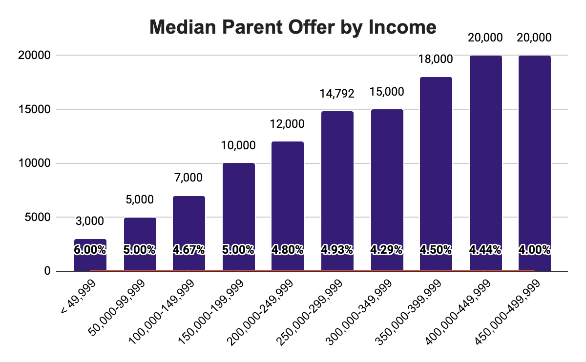
The percentage values in the columns show how the offer (at the top of the column) relates to the upper limit of that particular income band, so $3,000 represents 6% of $49,999 and $5,000 represents 5% of $99,999 etc. Notice how the percentages trend downwards as we go up the income scale. The median offer for families making $49,999 or less represents 6% of their income, but the median offer for parents making between $450,000 - $499,999 represents only 4% of theirs.
What might account for families at different income levels seeing the same percentage of income so differently? What does this tell us about the idea of affordability?
The pattern itself is the first clue. Families at different income levels don't think about affordability in proportional terms — what feels affordable isn't a fixed percentage of income that scales smoothly upward. So what exactly are we talking about when we bring up affordability?
Affordability is Inherently Subjective
One of the first things you realize when you start to work in the realm of financial aid is that people have very different ideas about what is and is not within their financial means. This aligns with the precise definition of affordability – the quality of being affordable, or believed to be within one’s financial means.
This definition, then, sounds inherently subjective. How are we supposed to see what’s really real? That’s where data comes in.
Rising Costs Are Real – But So Is Rising Income
When families talk about affordability, they’re usually talking about things getting more expensive relative to what they earn or what they have. That’s a reasonable way to think about it, and the data backs up the concern.
The Bureau of Labor Statistics (BLS) tracks the Consumer Price Index – a measure of how prices change over time for a standard basket of consumer goods and services.
.png)
The numbers on the Y-axis at left are relative to the time period from 1982-1984, which is indexed at 100.
Between January 2022 and March 2026, that basket of goods became 17.45% more expensive. The data clearly show that things get more expensive over time, but that’s not a surprise. What’s insightful is the rate of change, because that tends to be what consumers react to. The steepest climb came between January and June of 2022 – a 5.4% increase in just six months, the period that gave us the highest inflation rate in 40 years. When people talk about an “affordability crisis,” this is largely what they’re pointing to.
So, if costs are rising, you might assume affordability is getting worse for everyone, but the picture is more complicated.
A recent Wall Street Journal article cited an American Enterprise Institute study finding that the share of Americans in the upper middle class has grown from roughly 10% in 1979 to about 31% in 2024 — roughly tripling over 45 years. The study defines upper middle class as a family of three earning $133,000 to $400,000 in 2024 dollars, or about five to fifteen times the federal poverty threshold. However, as the WSJ notes, “There is no single, standard definition of middle class, or upper middle class, and what counts as a hefty income in one city can feel paltry in another.”
Even with that caveat, the finding is significant. The number of Americans earning between five and fifteen times the poverty level has increased substantially over the past two generations. This makes the persistence of affordability concerns more puzzling, not less. If more families are earning more, why does affordability still feel strained — including for families who, by income alone, look comfortable?
Part of the answer may lie in how income gains have been distributed across the broader population.
The Income Gap that Explains A Lot
If we try to zoom out and look at all families, we notice an interesting pattern.
The chart below is a visualization of the U.S. Census Bureau data on income quintiles in the U.S. from 2000 to 2024 (Table A-4b)*. Picture all American wage-earners in a given year standing in a line, arranged from the lowest income to the highest. Now divide them into five equal groups, and you have income quintiles for that year. Each line below represents the average income of one of these quintiles (20% of the population) at each point time. Additionally, the top line represents the average income of the top 5% of earners:
.png)
The first thing that we notice is that the lines get flatter the lower you go: the rate of increase is lower at the bottom of the chart than at the top. Because this chart shows inflation-adjusted dollars, a completely flat line would indicate that one’s buying power had remained the same over time, and an increase would indicate an uptick in buying power. But not all upticks are created equally:
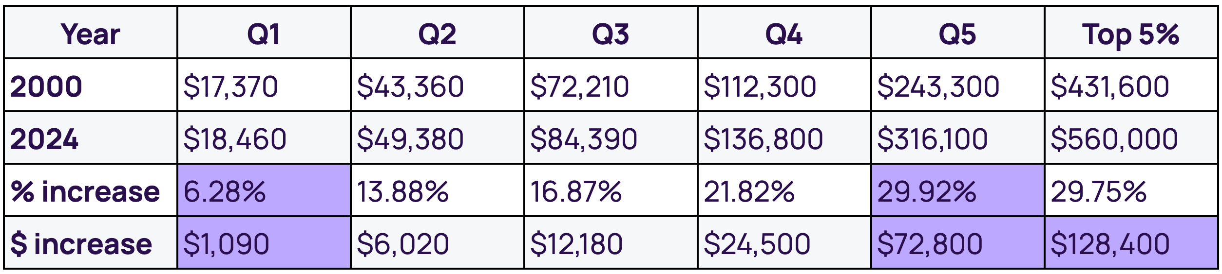
Looking at the bottom of the distribution, the average income for households in Quintile 1 in 2024 represents only 6.28% more real buying power than the average for Quintile 1 households in 2000. Compare that with a 29.92% increase at the top quintile position. In real dollars (adjusted for 2024), that's an average gain of just $1,090 at the bottom versus $72,800 at the top — over 66 times more. The top 5% position shows an even larger increase — $128,400, or over 117 times the bottom quintile's gain.
The middle of the distribution shows a clean gradient between these extremes: Q2 shows an increase of $6,020, Q3 $12,180, and Q4 $24,500. Each step up the distribution shows larger increases than the step below it, with the sharpest acceleration at the very top.
A couple of important caveats before we draw conclusions. These figures describe positions on the income distribution spectrum at two snapshots in time (2000 vs. 2024) — they don't track the same households over 24 years. People may move between quintiles throughout their lives due to career progression, retirement, life events, and so on. And because quintiles sort households by current income only, each band contains a mix of life stages — early-career workers, mid-career earners, retirees living on savings — which means within-band variation is significant.
What the data does establish clearly is that the income distribution itself has stretched. Whoever occupies the bottom quintile today is a greater distance from the top than someone in that position would have been in 2000. The middle and upper-middle positions gained less ground than the top. The relative weight of being in any particular income band — measured against where the top sits — has shifted considerably.
Combined with the cost increases shown in the CPI data, this distributional shift is one factor that may help explain why concerns about affordability are showing up at income levels that wouldn't traditionally have been associated with financial strain. How rising costs feel depends on whether your income has kept pace with the costs that matter most to you, and that calculus varies considerably even within the same income band.
So far, we've looked at how income has shifted and how costs have risen. But income and costs alone don't fully explain why families at similar income levels can have such different perceptions of affordability. In the next post, we'll look at the role of wealth — what families have accumulated, what they can draw on in difficult times, and how that shapes their sense of what they can afford. It's the layer that often explains why two families earning the same income answer the affordability question so differently.
*Data visualization produced by the author.
Never Miss an Insight from Clarity
Get our latest insights, case studies, and resources delivered directly to your inbox.